Home and Decor
4 min read
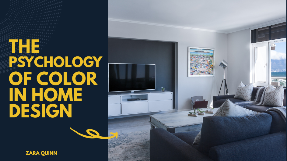
The Psychology of Color in Home Design: How to Choose the Right Shades for Every Room
June 24 , 2026
By Zara Quinn
Color is more than just a visual element in home design. It is a powerful psychological tool that can affect how you feel, think, and live.
Understanding the Psychology of Color in Home Design
Color is more than just a visual element in home design. It is a powerful psychological tool that can affect how you feel, think, and live. The colors you choose for your walls, furniture, and decor can influence your mood, energy levels, and even how much time you want to spend in a room. Whether you're designing a serene bedroom, a vibrant kitchen, or a productive home office, understanding the psychology of color in interior design can help you make better choices that align with your lifestyle and emotional needs.
Why Color Psychology Matters in Interior Design
Color psychology is the study of how colors impact human behavior and emotion. While reactions to color can be somewhat subjective, certain hues tend to evoke common emotional responses. In home design, these reactions can directly affect how comfortable and functional a space feels. By using color psychology strategically, you can create rooms that not only look beautiful but also serve a purpose, whether that's relaxation, inspiration, or focus.
Warm vs. Cool Colors: Setting the Tone
Understanding the difference between warm and cool colors is essential in home design. Warm colors like red, orange, and yellow tend to be stimulating and energetic. They can make a large room feel cozier and more inviting, but too much warmth can feel overwhelming in small spaces.
Cool colors such as blue, green, and purple evoke calmness and tranquility. These shades are perfect for creating peaceful environments but can feel cold or distant if not balanced with warmer accents or textures.
Color Psychology by Room
Living Room: Welcoming and Balanced
The living room is a social hub, so it is best to use colors that promote conversation and comfort. Earth tones, soft neutrals, and warm grays create a cozy, inclusive atmosphere. If you want to add energy, incorporate accent pieces in shades of coral or mustard. Avoid overly stark or bold colors that can feel too intense for long periods of relaxation.
Kitchen: Inviting and Energizing
The kitchen is often the heart of the home, and it benefits from lively, warm tones. Shades like soft yellows, warm whites, or even light greens can stimulate appetite and promote cheerfulness. Red is known to increase appetite, but use it sparingly, as too much can feel overwhelming.
Bedroom: Calm and Restorative
For restful sleep and relaxation, stick to soothing, cool colors like soft blues, gentle greens, or muted lavenders. These colors are associated with calmness and help lower stress levels. Avoid high-energy colors like bright red or orange, which can be too stimulating and disruptive to your sleep cycle.
Bathroom: Clean and Refreshing
White is a classic choice for bathrooms because it represents cleanliness and simplicity. However, soft blues, seafoam greens, and pale grays can add personality without disrupting the sense of freshness. These colors also evoke water and nature, enhancing the spa-like feel of a well-designed bathroom.
Home Office: Focused and Motivated
Color can significantly impact productivity and concentration. Blues are known to promote focus and mental clarity, making them an ideal choice for a workspace. If you need a boost in creativity, try adding accents in orange or yellow. Avoid overly dark or saturated colors, which can feel heavy and draining over time.
Children’s Rooms: Stimulating Yet Soothing
In kids’ spaces, it is important to strike a balance between stimulation and calm. Soft pastels like peach, mint, or lavender can provide a cheerful yet soothing environment. Bright primary colors can be incorporated in small doses through toys, furniture, or wall art to encourage play and imagination.
Tips for Using Color Effectively in Your Home
- Test Before You Commit: Always sample paint colors in different lighting throughout the day. Natural and artificial light can dramatically affect how a color looks.
- Use Accent Colors: If you love a bold color but do not want to commit to painting an entire wall, try using it as an accent in pillows, artwork, or a single feature wall.
- Balance with Neutrals: Neutrals like white, beige, gray, and taupe can help ground a space and prevent strong colors from becoming overpowering.
- Consider the Flow: Think about how the colors in adjacent rooms relate to each other. A cohesive palette throughout your home makes for a harmonious living experience.
Designing with Emotion in Mind
The psychology of color in home design is more than a trend. It is a thoughtful approach to creating spaces that feel good to live in. Whether you want to cultivate calm, encourage creativity, or simply make your home more inviting, understanding how color affects the mind can guide you to better design decisions. With the right palette, your home can become a true reflection of your personality and emotional needs.
live smarter
Shop smarter, live better, and stay ahead of the trends with our reliable recommendations!


Gadgets and Tech
2 min read
Gadgets and Tech Innovations That Shape Smart Living and the Digital Future

Fitness and Sports
7 min read
The Ultimate Hydration Trio: Coldest 32oz Sports Bottle, Half Gallon Jug, and Insulated Espresso Cup
Gadgets and Tech
6 min read
Light Up Your Life: Poplight Sage Green Wall Light, Matte Black Battery Pack & USB-C Charging Cord Review

trending
Home and Decor
2 min read
Home and Decor Ideas That Redefine Comfort, Style, and Modern Living Spaces
Home and Decor
2 min read
Home and Decor Ideas That Transform Living Spaces Into Stylish, Comfortable, and Modern Homes
Home and Decor
2 min read
Home and Decor Ideas That Elevate Style, Comfort, and Modern Living Spaces
Home and Decor
2 min read
Home and Decor Ideas That Transform Spaces Into Stylish, Cozy, and Modern Living Environments
Home and Decor
1 min read